
6 BASIC INTERIOR DESIGN PRINCIPLES EVERYONE SHOULD KNOW
- Dhinesh Prabhas
- Dec 18, 2020
- 5 min read

Balance


As a design principle, balance is defined as the equal distribution of visual weight in a room. In interior design, there are three styles of balance, including symmetrical, which is found in many traditional interiors. Its symmetry is easy on the eyes, creating a pleasant visual effect that mirrors each side of the room equally. In contrast, asymmetrical balance is less rigid and structured, giving home decor a more casual and comfortable vibe. Another type of balance is radial symmetry, which brings all the elements of a design into a central focal point. Although not often used in interior design, radial symmetry can add an interesting look that anchors the rest of the room, such as a spiral staircase.
Proportion & Scale


In the design world, proportion and scale go hand-in-hand but there are slight differences that are worth mentioning. Both are related to size and shape, but proportion is different because it involves the ratio of one design compared to the whole space.
When it comes to scale, the ratio simply concerns the size of one object compared to the other. When using scale and proportion in design, we recommend offsetting standard elements with different sizes and heights, which can create some striking visual interest in a room. You can experiment with scale and proportion in several ways, such as artwork, plants, and negative spaces throughout your home. Using your intuition and basic principles of scale and proportion, you can try different arrangements that please the eyes with an interesting focal point.
Focal Point & Emphasis


A boring and uninspired space is one of the biggest challenges for interior designers. An easy way to create a lasting impression is by bringing the attention towards a focal point that draws in the eye. When choosing what elements to emphasize in a design, you should look for a statement piece that takes center stage in a space. A common focal point for living rooms, for example, is afireplace or couch, which can be further emphasized with accents in bold colors or patterns. This basic interior design principle applies to other rooms in the house, including the bedroom, bathrooms, and other areas.
Rhythm


In the same way that it creates patterns in music, rhythm can also be used in interior design for enhancing visual interest. In home decor, there are several ways that rhythm is expressed in interior design. For instance, when you incorporate repetition in your interior design, it will help give your space a cohesive look that ties all the other elements together.
Another type of rhythm is progression, which emphasizes a feature and increases or decreases one or more of its characteristics. A popular example of progression is a gradation by size, such as a cluster of various-sized candles or other items on a tray, which has a pleasant visual effect. A natural progression can also be achieved with a monochromatic color scheme that includes a slightly different shade of the same hue.
Transition is also used in design to allow the eyes to move easily around the room from one area to the other. For example, curved lines in wood paneling can help to define spaces such as a doorway or winding path.
A hallmark of rhythm in interior design also includes playing up contrasts, such as light and dark colored pillows on a sofa or opposite shapes like circles and squares presented together in a pattern. Because this kind of rhythm produces a striking aesthetic effect, designers like to add contrast to liven up spaces. But it can be jarring if you overdo it, so stay on the safe side and always use in moderation.
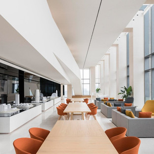
Color


In interior design, the effects of colors are expressed in three basic ways: active, passive, and neutral. For instance, light, passive colors create an expansive and airy effect, which makes a room seem larger and brighter. For home decor that is intimate and cozy, dark and active colors are ideal for large rooms because they add warmth and sophistication to the overall design.
Each color in the spectrum is known for its unique properties and visual effects. Red, for instance, is considered the most intense color, which makes it particularly useful for brightening up a space; in the living room or dining room, intense and eye-catching red draws people together in the shared areas of the home. According to interior designer Mihai of Freshome, red is the perfect color for areas in your home where you want to have a strong first impression, such as an entryway. Red can also be used in the bedroom as wall paint, which will appear rich and elegant after dark when the hue is muted by warm and diffused lamplight.
One of the best colors for kitchens, bathrooms, and dining rooms, yellow is a bright and cheerful hue that has an uplifting and energizing effect. If you opt for yellow in your home decor, use it in moderation as an accent shade since it can be overwhelming as the main color scheme. For a peaceful and calming effect, blue is known for its calming and relaxing properties, which is why interior designers like to use it for bedrooms and bathrooms. Another soothing and peaceful color option is green, one of the most popular shades for decorating.
For a touch of luxury and opulence, purple in its darkest values, such as eggplant, is rich, dramatic, and elegant; when used as an accent or secondary color, it adds depth and character to a design scheme. The most energetic color in the spectrum is orange, which is best relegated to an exercise room or studio. Its effects will help boost your energy and motivation during workout sessions.
Finally, neutrals like black, gray, white, and brown are the essential colors for every decorator’s arsenal. Black should be used in small amounts as an accent, which will help define the space and stabilize the overall color scheme. Light-colored neutrals are the optimal choice when you want to add a mellow and calming vibe.
Harmony


Bringing all these design principles into play, harmony in interior design can be achieved when you incorporate balance, scale, proportion, and repetition in the right amounts. A space designed with harmony should feel complete because all the elements complement each other. To ensure a harmonious design in any room, it’s important to consider the entire home as a series of interconnected spaces.
For a unified look, designers like to use color schemes as an effortless way to bring together a collection of spaces. The best way to achieve harmony in your interior design is by using all of the basic design principles and a little bit of your own intuition. Just like Goldilocks, you’ll just ‘know’ when a space feels right; when you walk into the room, you should always feel comfortable and at ease.
Look out for more design tips from the DPinteriorzz blog, your source for the latest trends in interior design.


Comments